Today, opening Rapid Access or Rapid Monitor within Aware, means landing on a log. In Access, a list of check-in records. In Monitor, a list of safety events. Both are useful when you already know what you are looking for. However, neither tells you what is actually happening across your sites.
That’s why new Summary pages are coming soon.
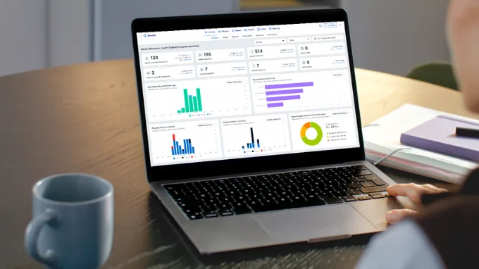
Summary will soon be the first thing you see in both Access and Monitor within Aware, with the picture already assembled before you navigate to check-in logs or any other part of the app.
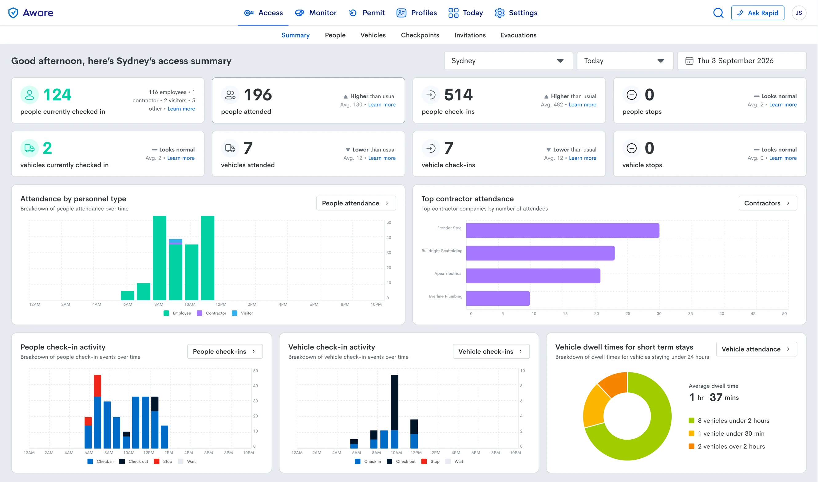
The new page does something logs cannot. Every figure is shown against what is normal for your site, flagged as higher than usual, lower than usual, or normal, with your site’s own average next to it. A busy day and an unusual day will no longer look the same.
What you’ll see in Rapid Access
Summary will open with live counts of the people currently on site, broken down by employees, contractors and visitors. Alongside them are attendance, check-ins and stops for the period you choose, attendance by personnel type across the day, the contractor companies with the most people on site, and check-in activity through the day.
If you have integrated our software with cameras at vehicle check points, you’ll also get dwell times and live counts of every vehicle on site.
It’s the view you’re likely assembling in your head from the check-in log today. Soon it will simply be there, right in front of you.
What you’ll see in Monitor
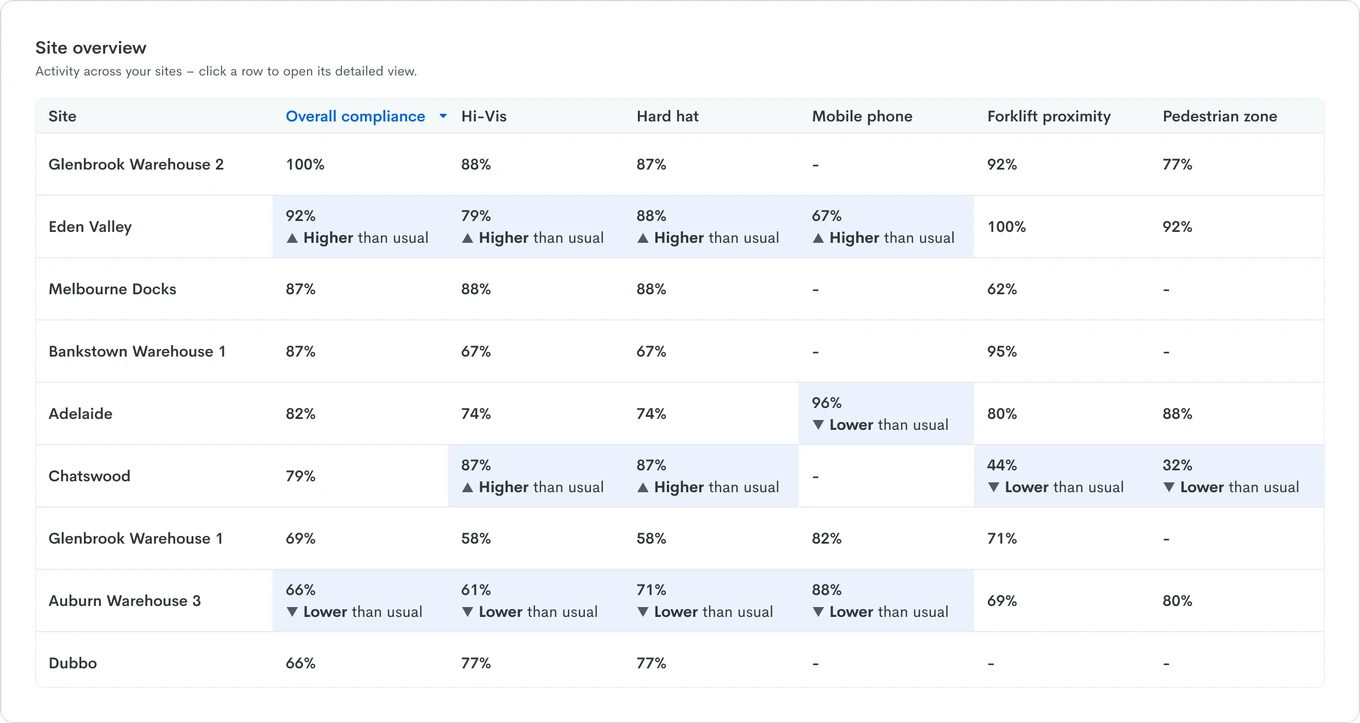
If you have integrated our software with your workplace cameras, Summary will open with overall safety compliance, and cover the key indicators you’re tracking such as PPE compliance, and behavioural compliance.
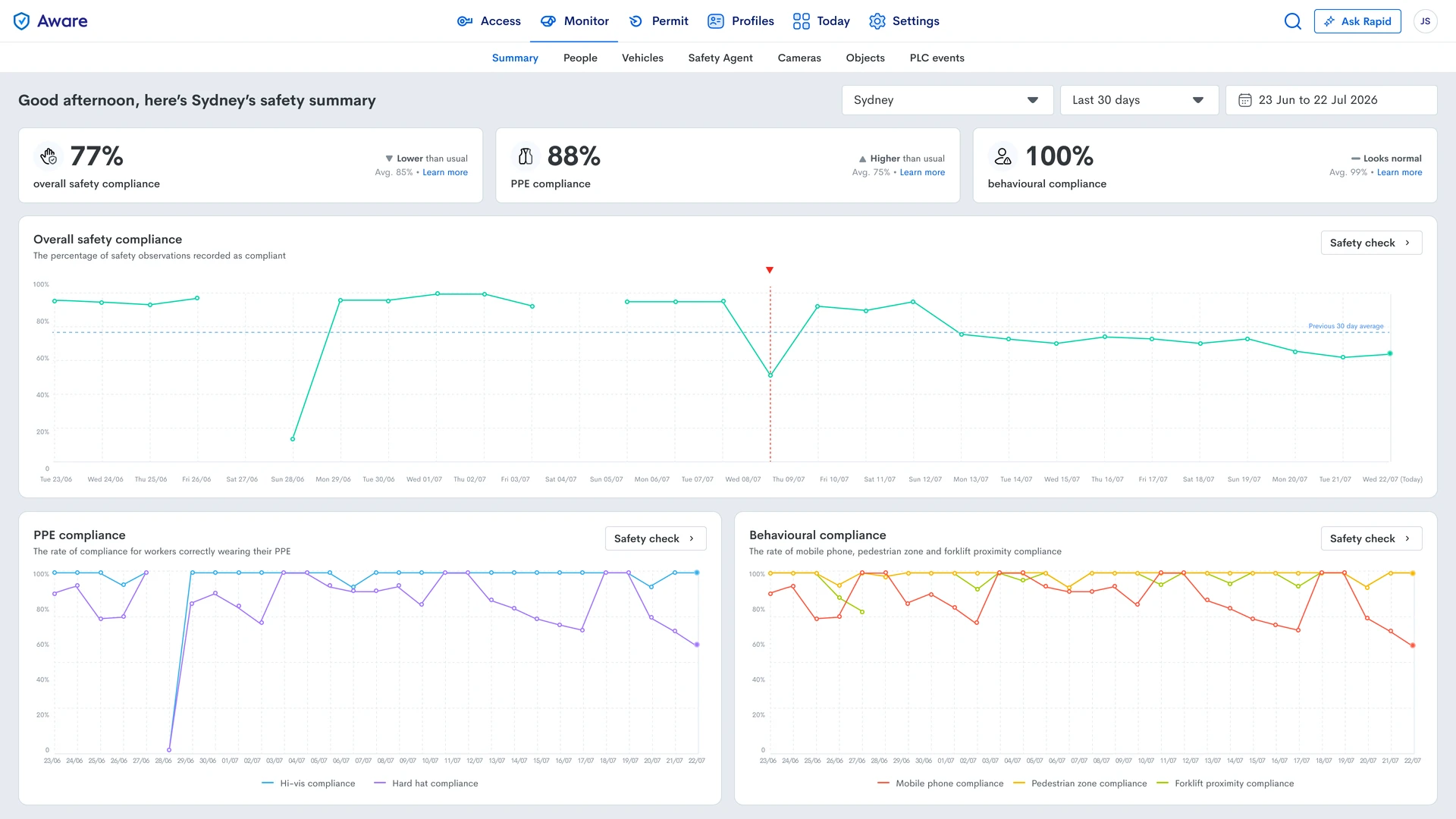
The trend behind each indicator will be visible across the period you select. A rate on its own tells you where you are. The trend tells you which way you are heading, and whether a low number is a single bad day or the shape of the whole month.
If you run more than one site
Comparing sites has always meant opening them one at a time. Summary will list them together, then go further and name the sites behaving differently from their own typical range, along with the measures they differ on.
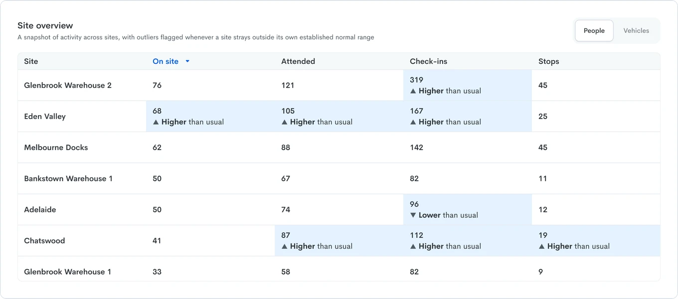
Not every site is comparable to each other. For example, what’s normal for a busy depot might be a really busy day for a quiet regional yard. Summary measures each site against its own established range, so the sites it flags are the ones genuinely worth a look, not simply the largest ones.
Your logs aren’t going anywhere
Summary will be a new starting point, not a replacement for the logs you’re used to. Every check-in record in Access, for example, will still be under People. Summary will just be what you see first.

If you are using traditional Rapid Access rather than Access within Aware
If your team is still working in our traditional Rapid Access, Summary will be a good reason to look at what your own data looks like in Aware. The same check-ins you record today, assembled into a view of your sites rather than a list of entries, with the comparison to normal already done. You will find an invitation to do exactly that within Rapid Access shortly.
Look out for Summary
Summary is coming soon to Access and Monitor in Aware. Keep an eye out for it: once it’s live, it will be the first page you land on. When you’ve had a look, tell us what you’d like to see on it. The quickest way is to leave feedback from the page itself.