We have introduced three new icons on the dashboard of our contractor management software Rapid Contractor Management. The three new icons, “Companies”, “Documents”, and “Workers” will enhance the user experience for administrators navigating the platform.
How does it work?
The new “Companies”, “Documents” and “Workers” icons appear in the top left of the dashboard. Clicking each icon allows users the ability to show or hide the associated summary area. For example, clicking on “Companies” will hide the “Companies” summary circles as shown below.
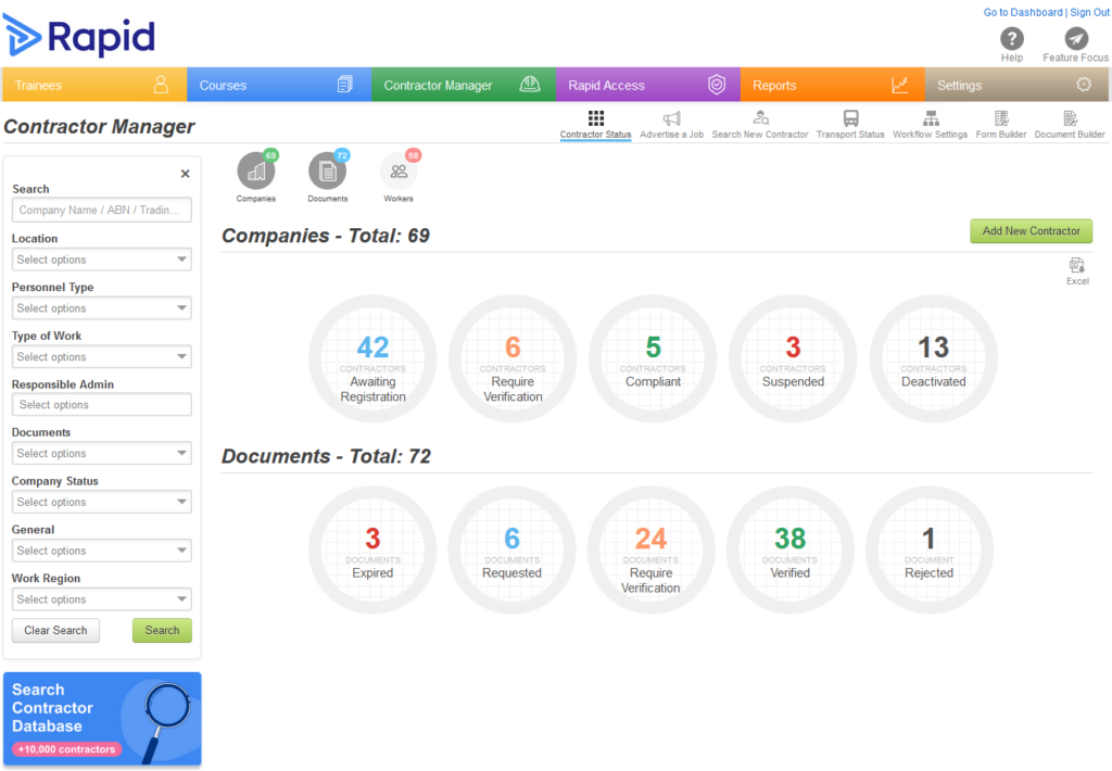
On the first load of the Rapid Contractor Management dashboard, the “Workers” summary will be hidden while the “Company” and “Documents” summaries will appear. If desired, the user can easily click the “Workers” icon to show this information as well.
Why have we made this change?
This change aligns the information available with the same summary information shown on the Trainee Dashboard.
Additionally, as the “Worker” summary circles require more system processing, showing them only upon user request optimises system efficiency. Having this customisation available also puts control in your hands, allowing you to tailor your view to highlight only the data you need.
What other updates are coming for Rapid Contractor Management?
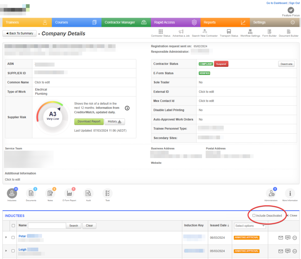
There is now a checkbox that can be used to include deactivated inductees from the Inductees grid within the company record. This will help with reports and day-to-day admin.
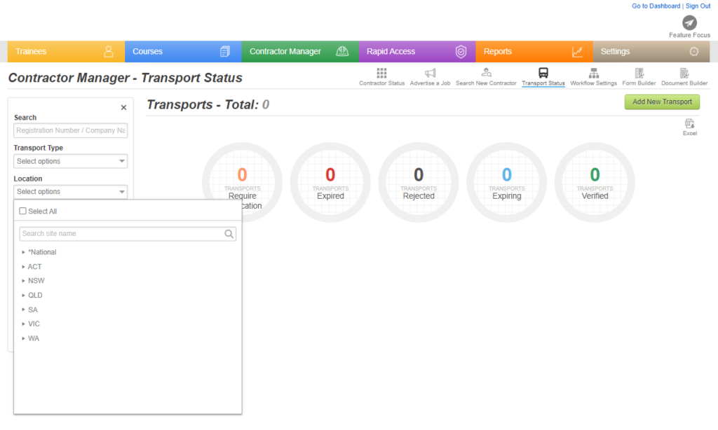
In the Transport Status dashboard, transport entries can now be filtered by location. The new field gives you the ability to choose multiple sites, making searching for transport more efficient.
We’re always listening
We work closely with our clients to develop new features and ensure our products are up to date to support your business now and into the future.
To find out more about Rapid’s modular workforce management system, speak to our experts today and request a free demonstration.


