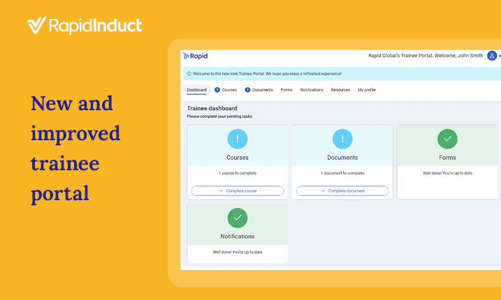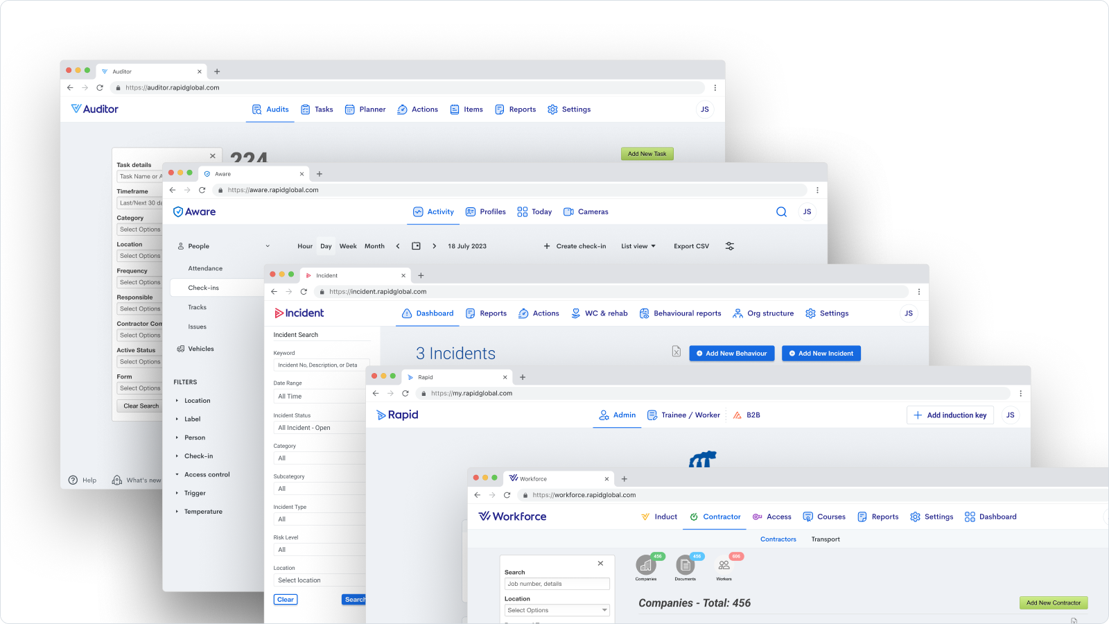

Users logging into Rapid’s health and safety system will notice the fresh new look!
To accomplish tasks efficiently, software needs to be intuitive, easy to navigate, and visually appealing. That’s why we’re excited to announce the changes we’ve made to the header and footer of our web application, which will unify the look and feel of all the Rapid modules.
Changes are minimal
Before we look at what’s changed, let’s start with what has stayed the same.
Each of Rapid’s modules has maintained its existing content, sections, and functionality. The mobile apps have not changed either. You can perform all tasks just like you currently do.
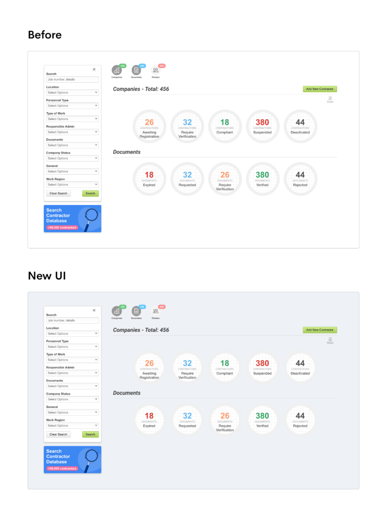
The main difference is we’ve redesigned the header and footer, which we’ll explore in more detail in this blog.
As illustrated below, the main content area remains largely unchanged, except for the updated background colour.
A more uniform experience
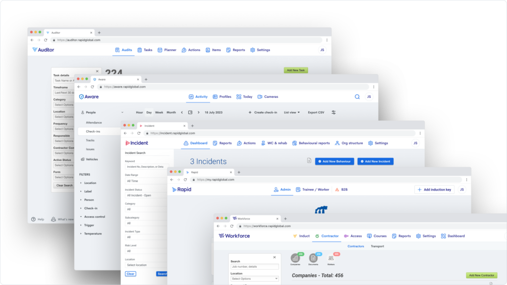
While each Rapid module serves it’s unique purposes and has distinct features, consolidating their appearance is important to providing you with a consistent experience and make going about your every day tasks simpler and quicker.
Redesigning the navigation area and footer is the first step towards unifying our suite of solutions, ensuring a seamless, coherent, and fully integrated experience across all the Rapid system.
- The module you are in is now clearly highlighted within the menu options and the name displayed top left, so you know exactly where you are at any time.
- The headers appear on a white background, making them easier to read.
- The modules: Rapid Induct, Rapid Contractor Management and Rapid Access are now categorised as ‘Workforce’ and maintain the same headers you are used to.
Helpful links, just one click away
The new footer is designed to stay fixed at the bottom of your screen as you navigate and includes convenient links to request Support and review our Knowledge Center, ensuring you’re in the loop with the latest product releases, and help is always to hand.
The footer also displays the company name, so you know exactly which company the content you’re working on relates to.

MyRapid’s new look
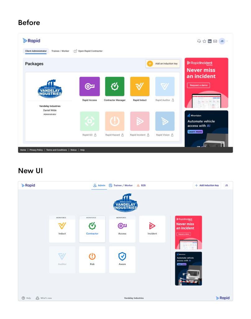
The home portal also has a new look: a cleaner layout with updated module cards. If any of them pique your interest, you can request a demonstration to learn more.
Our brand new module Rapid Aware, will appear in the MyRapid portal soon. This exciting new module, leverages AI-powered computer vision technology to streamline site access, enforce site-wide compliance, and can detect unsafe behaviour and hazards on your sites before they become an issue.
An even better user experience is coming…
Rapid’s mission of making workplaces safer, means we are constantly innovating our software to make it easier to use and help you work more efficiently. These design changes are the first of many exciting product developments to come and will lay the foundation to deliver more value to you in the months and years ahead.


